
Old School Human Machine Interface Blunders
Published:
A common human machine interface that most of us see everyday is our dashboard. Information such as engine RPM, vehicle speed, coolant temperature, and gas level are provided. An example of is provided from the dashboard of a 1987 Cadillac Allante.
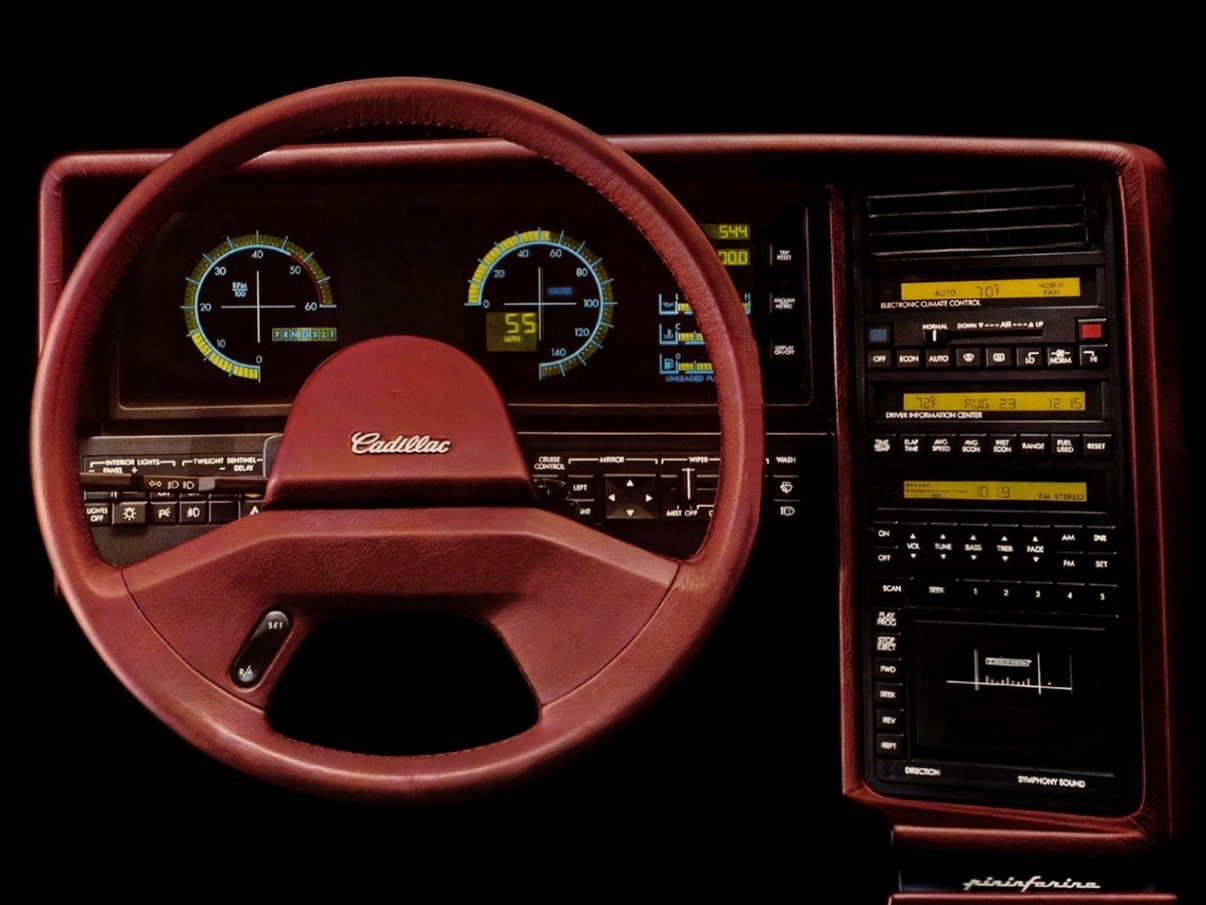
Figure 1. The dashboard of a 1987 Cadillac Allante.
The Allante dashboard does not provide concise information to the driver, it is hard to tell the difference between this and say the interior of the Apollo space capsule. There are far too many buttons and switches plastered all across a flat board right in front of the driver. Especially behind the steering wheel. A better distribution or layout of the dashboard might improve the users experience when operating this vehicle.
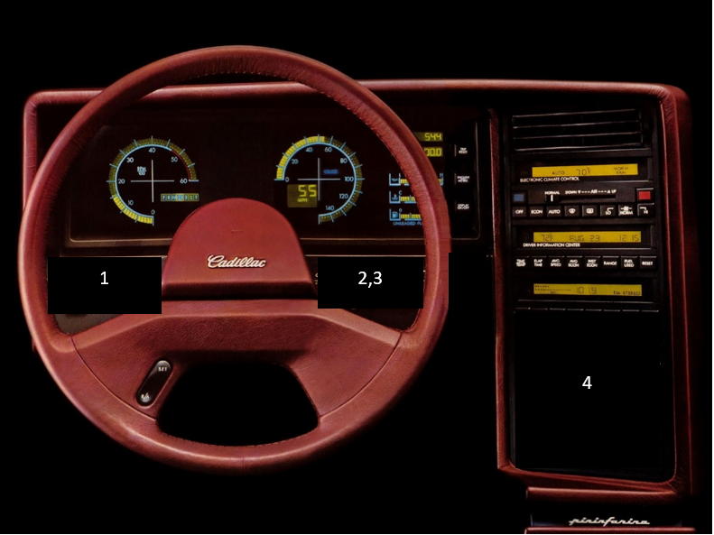
Figure 2. The numbered regions correspond to the list of design change recommendations.
Design Change Recommendations
- The interior lights controls should be moved to the overhead near the light itself.
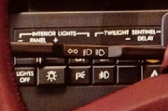
Figure 3. Close up view of the left side of the dashboard.
- Adding a potentiometer on the end of the turn signal bar would be a good place for the wind shield wiper delay
- The mirror control could be moved to the far left side so the user does can stay in the normal driving position and adjust the mirror position without needing to reach up through the wheel
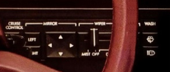
Figure 4. Close up view of the right side of the dashboard.
- The 8 track was cool once, but these days you can save a lot more space with just a standard radio.
With these changes in mind, I would love to see this asthetic make a come back if we dont do away with steering wheels altogether in the future.
References